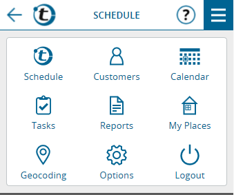
By clicking the now more prominent main menu button, the menu items appear as icons to make better use of space on smartphones:
If there are important notes, the main menu button will turn red:
On large screens, “Tasks” and “Reports” are accessible directly from the main menu bar:
The original main menu entry “Appointments” has been renamed to “Calendar”, because the calendar view has been extended by new functions over time and now also shows call suggestions, reports and tasks besides appointments.
The “Calendar” entry in the main menu now always opens the calendar view. To get to the list view of appointments, click the list button in the calendar.
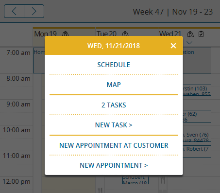
The day headings of the calendar have a new design. The labels appear in a larger font, the reference to the map and the presence of tasks are represented by symbols. The small arrow pointing downwards indicates that a menu will open with a click.
In addition to the already familiar link to the map, this menu also contains a new link to the schedule for the day and new functions for task management.
Furthermore, for a better overview in the weekly and monthly calendar, only those weekdays are displayed that are scheduled for visits according to the working hours set in the options. If an appointment is entered on a day off, this day is also displayed in the calendar.


