Until now, the statistics of the portatour® Report have always included all reports created in portatour®. Since last week’s update, you can now filter certain report types directly in the portatour® Report.
To do this, click the black funnel icon. This is available in the portatour® Report in the following three sections: “Customer Call Reports”, “Daily Summary of Last and Current Week” and “My Key Figures of the Last 90 Days”.
An additional line appears with the report types that can be filtered. In parentheses, you can find the number of reports affected by report type. If you do not want to include the customer calls of a given type in the statistics below, remove the checkmark for the respective report category. All the values in the statistics shown in blue have an effect on filtering.
There are a total of six report types in portatour®. The following procedure describes how to create reports of these types in portatour® Anywhere:
- Customer Call: By clicking “Called Now” for a customer or “Took Place” for an appointment. The prerequisite for this is that reports for customer calls are enabled in the Reporting options (setting: “Ask Every Time”, “Open Automatically” or “Create Automatically”).
- Missed: By clicking “Missed” for a customer or an appointment. The prerequisite for this is that reports for missed calls are enabled in the Reporting options.
- Other: By clicking “New Report” for a customer or “Took Place” for an appointment without location, for example, to log phone calls.
- Start of work: By clicking “Clock In” in the Reports menu.
- End of work: When you click “Clock Out” in the Reports menu.
- Day off: By clicking “Report Day Off” in the Reports menu.
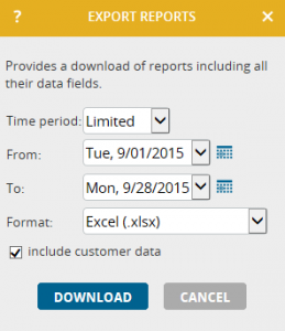
Note: In portatour® Anywhere, when you create or edit a report, you see the report type displayed in the form’s title bar . When you export the reports as an Excel or CSV file, you find the report type in a column as a number (0-5) and broken down into a second column for the display name.


